Thursday, July 29, 2010

The Hudson River School, Conceptualism, & My Approach to Art


gosh, that sounds grandiose! but i got to thinking & trying to work out some concepts - but mostly to start to understand what art is for me.

Albert Bierstadt: Sierra Nevada

in her last couple of posts, jan blencowe has written in response to this essay about the sondheim prize competition by michael salcman. she was, in particular, responding to his statement, "The Hudson River School painters were among the last artists to believe that art should be good for you; according to Robert Hughes, they suffered from the fallacy of "moral uplift"."

her response, in part, is, "being a lover of the Hudson River School and a painter of poetic, spiritual landscapes meant to uplift viewers I took exception to this idea. Hughes makes quite a sweeping statement ... . I'm not sure how you could even prove that statement, particularly in the face of 5,000 years of ... people ... confirming ... that they have been uplifted, morally and otherwise, by art."

this brings up a really interesting point about art: does one create art from a place of intent - that is, an anticipated reaction on the part of the viewer? or from the inner urgings of self-exploration, spirituality, &/or simply creativity & imagination? or both?

i too love the hudson river school (i saw olana when i was young - it filled me with the desire to make art & left a lasting impression). it is not, to me, 'moral' in the sense of good/bad, right/wrong culturally-based judgment. it is uplifting in the sense of presenting a glimpse into that which moves the viewer on a deeper level than what we usually experience with our very limited human senses. to experience this, i think we have to open ourselves to experience wonder - just exactly what art can do - for both the viewer & the artist!

in discussing art since the hudson river school, salcman writes, "Gradually the conceptual ethos took over the art world . . .. Conceptualism was critical to ... the death of the masterpiece, and the end of beauty. ... The scattered room, the polymorphous object and the rotoscope are the tired tropes of our time with little meaning other than the enactment of a predetermined philosophical bias." oh dear! not the art i want to make.

so what do i want to make? what do i want people to experience when they view my art? well, i know i want them to have fun! to be glad they have seen it, to enjoy the glimpse into my perceptions of the world that my art may give them - maybe even give them an opening to see things a bit differently in unexpected ways. and, as i begin to explore doing landscapes, to open to that sense of spirituality that i find in the hills, fields, streams, mountains, oceans, trees, rocks, earth, & sky. it's that sense of seeing/exploring/revealing/developing my inner world, including my spiritual sensibility, that i want to convey in my art. even if that's just reveling in yummylicious baked goods or floating cherries!

Frederic Church: West Rock, New Haven

Tuesday, July 27, 2010

The Evolution of a Painting

hi there!

i wanted to take you through the process of creating what i think is my most successful painting to date - i totally love this one!

it all started one day when my son brought home some day-old baked goods - which included this delicious item!

i actually did ask permission to take it - tho, yes, i promised to give it back when i was done! (unfortunately, it was pretty stale by then, & the dog got a yummy treat!)

i tried sketching it in pencil, but just couldn't get something i liked. so i took out my trusty camera & starting shooting away, putting the plate on various surfaces. when i got the above photo, i knew it was right - the background colors set off the main yellows of the center of interest really nicely!

i then decided on which paints to use. i don't know why i do this in advance, except (a) i have way too many colors & have to narrow them down from the git-go! & (b) this is when i really study what i'm painting, looking at all the colors in the body, foreground, background, highlights, & shadows. this is what i came up with - more than i usually use (i normally stick to about 5), but i felt i needed a wider range of reds & yellows for this one.

i had been reading some daily painters' blogs online by then, and saw that one of the most frequent sizes used was 5x7. so i chose a 5x7 canvas, and toned it with cad yellow light. when it was dry, i did the sketch-in, first lightly with charcoal & then using terra rosa. i had a lot of trouble (as always!) with proportions and placement - and, if you enlarge the pic, you'll see an area that's all shiny - that's where i dampened a paper towel with walnut oil & erased some of the sketch! i put in the main forms & all the shadows - and liked it!


next i put in the table & background. i chose alizarin for the main color for the table, and prussian blue for the background. these two tend toward purple (at least how i see 'em & experience them!), so i thought they would nicely compliment the yellows of the center of interest. i worked them around a bit, adding this & that until i liked the texture of the colors, and called them done.

the plate came next - i had to lighten up what was there, and add the beginnings of shape, shadow, & highlights for both the plate & the treat. this became my first block-in:

"all" that was left was to complete the yummy center of interest. i switched to opaque colors to be sure it held the attention i wanted it too. i worked away on the frosting, filling, and main shape, concentrating on the shadows &, lastly, the highlights. (altogether, it took me 4 painting days of my usual about two hours a time.) and here it is!

looking back on it, i really like the way the plate came out, with its shiny parts & the deep yellow for part of the shadow. and also the composition, with the edge slightly cropped & it filling so much of the space.

i found the perfect frame for it - the blue really does good things for it!

thanks for stopping by - take care till next time!

dusty!

Friday, July 23, 2010

Toning Canvases

hi there!

i find that any little thing - like having my supplies in disarray, or the palette not clean, or no prepared canvases/supports - will be enough of a hitch to make me procrastinate even more than i am already genetically inclined to do - which is a lot! wednesday i toned 10 canvases so i won't have any excuse (once they're dried, of course!) to not grab one & start painting!

the process is really simple, so i'll show that first - then i'll talk abt why i do it!

i've used a number of different colors to tone supports - one at a time, that is! (the other week i saw an oil painter out on the bluffs - and it looked like he'd toned his canvas with at least four or five different, light hues randomly placed on the surface - one day i'll be brave & try that!) in the past i've generally chosen cad yellow light. but when i finished my cherries, i decided to use all the leftover paint to do it - well, all the lighter colors. but there wasn't enough so i decided to be bold & went - gold! i mixed titanium white, raw sienna, and cad yellow.

i used a 2 1/2" hardware store bristle brush (even on the smallest canvas!) & distributed the paint all over the surface:


i used cross strokes to get the paint spread evenly, then ended with strokes all in one direction. this is what they look like finished:


i already have plans for some of them. the biggest (16x20) will be the largest i've ever done! and the smallest (1"square!), the smallest! it's a good idea (especially if you're a procrastinator like i am!) to have a goodly selection of prepared supports around, so you can have be ready for any painting project. (i love fun canvas sizes to play with, too!) these will take a while to dry, even tho i tried to keep the coat pretty thin. but i've found, for me, it's best to let them dry thoroughly before starting.

a number of the authors i've listed over there to the right don't suggest toning at all, believing the white of the canvas is the best color to judge values by as well as provide luminescence to the finished painting. on the other hand, there are lots of reasons to tone the surface first. many of the books suggest doing it so that the resulting painting will be unified, figuring that some of the color will show through throughout the painting. others suggest it's easier psychologically to make the first strokes if there's already color down. still others say it's easier to judge values if you already have a constant value on the surface.

for me, the last two reasons to tone work. when i paint, i cover (or have to now!) the surface too completely for much, if any, of the original color to show through. the rare cases it does, is when i've deliberately used a transparent color over it, in backgrounds or shadows, that i've chosen to combine with the tone color to provide depth & a feeling of luminescence. but i do find it really is easier to make those first few strokes on a canvas i've already had fun smearing paint all over! and i do find it easier to judge values than on a white surface.

but even if all that weren't true, i'd still pre-paint the canvas, even with white. when i first started painting, i used gessoed cardboard. i found that even with two coats of gesso, the support absorbed a lot of the oil in the paints, giving a matte finish to the painting - which i totally didn't like! even when i switched to commercially prepared 'real' surfaces (as opposed to cut-up soy milk boxes!), the same thing would happen.

part of this is because i tend to paint fairly thinly, especially my backgrounds, and i don't add extra oil to the paint. areas that have thicker paint do tend to be more glossy, so if there's a mix of thick & thin, the painting dries splotchy-looking in terms of the sheen. totally not cool, at least for me! (i'm also beginning to wonder if the more white a color has mixed into it, the more matte it is likely to dry. have any of you noticed this?)

i've tried several things to avoid this. one that didn't work was to cover the finished, completely dried painting with a layer of clear walnut oil. it took forever to dry, and still looked splotchy to me. i like the pic, tho, & have framed it under glass to hide the unevenness!

other times, i've tried adding a bit of clear oil over still-damp areas that looked like they were trying to dry matte. oh dear! didn't dry well & if i weren't very careful, i'd end up diluting or even erasing the original paint!

then at some point, i painted a couple of pics that i really wasn't happy with, & i wiped them out - while they were still wet. this resulted in a smooth layer of oil paint over the surface which i let dry. one was, in general, orange, and the other yellow. i decided to paint matching pictures - on the yellow, a brown couch, and on the orange, a blue. the paint went down really nicely - smooth, clean, easy to wipe out if i wanted to change something - a whole different experience! and even tho i painted pretty thinly over large areas of each one, they dried to an even gloss.

and here they are, hanging together at a local gallery!


(they're based on manips i did of the same image, just playing around with the 'curves' setting.)

they were a lot of fun to do - in good part due to how easy it was to lay down the paint. so now i'm toning all of my canvases. i'm hoping the gold will provide a more middle value to judge by than the cad yellow light, and also it is closer to the color of the table that shows through my glass palette where i mix my colors!

till next time - take care - and thanks for stopping by!

dusty!

Tuesday, July 20, 2010

My Oil Jar

time to take a close-up look at my oil jar! this set-up has saved me a lot of time & trouble & is really worth doing when you're working with just walnut oil as your brush cleaner.

i kept reading in a number of books about setting one of these jars up - you put a can with holes pierced in it in a jar, the point being that when you clean the brush, the paint will drop to the bottom & the cleaner above the can will become free of paint. great idea, but i thought it would only work with turpentine & other more liquidy cleaners.

clean-up was taking me a long time, though, and i was using a lot of brushes as i was painting (to be sure of keeping the colors going down on the canvas clean), so i decided to try it, using my walnut oil - and it works! saves huge amounts of time doing the final clean-up, and makes cleaning the brushes while painting fast & easy! it even saves on oil, which is mightily expensive! i'll go over the steps briefly here, as you've probably seen them elsewhere.

first - start with a pint Ball jar (or other jar that will seal really well) & a can of cat food.


this is a 3oz can, which fits perfectly into the jar. you may have to experiment, depending on the size jar you use, with other cans (tuna, canned chicken, etc). (and thank you, mitch & jim, for the kitty can!)

feed the cat food to your cat. or dog. or if it's tuna - you! remove the label, wash & dry the can, then poke holes in the bottom of it from the outside going in. slip it into the Ball jar so the bottom is facing up. then fill the jar with walnut oil to about a quarter-inch over the top of the can - like this:


you can see how clear the oil becomes after the paint has settled to the bottom (the white-ish layer under the can). i was amazed it really works with the oil!

here's a view of the can, bottom-side up with the piercings (i used a nut pick - do be careful not to perforate yourself!):


to use it while i'm painting, i wipe the paint off the brush onto a paper towel or paper napkin, then rub the brush across the can a few times (being careful not to smush the bristles). i then rub it again on a clean spot on the towel, check that it left no color, and it's ready for using again. this has really helped cut down on the number of brushes i use when i do a painting, and makes me more careful to be sure my colors are really clean.

for clean-up when you're done, just do the above to all the brushes, then wash 'em with a mild liquid soap (i use lifeline) & warm water. after that i give them one wash with a commercial brush soap, then rinse, dry with a paper towel & that's that! so much easier & faster!


till next time - take care - and thank you for stopping by!

dusty!

Sunday, July 18, 2010

Cherries - Finished!


i'm happy with them! here it is (i know - the suspense was getting to me too - like an old-fashioned cliff-hanger!):

i don't have any process photos, but i do have two close-ups of each set of cherries, so you can see the little areas the stems come out from and the stems, which are what i did today:


the stems were very hard for me - my hands shake (i think it's genetic; my dad & son have it too) & i needed to use goodly blobs of paint for them so it would lay on top of the previous, still wet, paint without picking up the reds & purples. but it turned out i needed to q-tip only two of them!

at first i used my trusty 0 sable filbert, but it lay down too thick a line. then i tried the long edge of the 4 flat sable & that worked well. i also used both those brushes to do all the details of the little petal-type things at the stems' bases, as well as adjust the colors of the main cherry. i realized, once the stem was on it, that i'd not gotten the colors right to indicate the cherry's roundness in the center and the shadowing on its lower left, and also that the highlights had to be crisper.

i submitted it to rookiepainter & it's up already! the other paintings are really wonderful! and such a range of interpretations! check it out here:

http://rookiepainter.blogspot.com/

i'm looking forward to the next challenge! it was an interesting experience, developing the picture while others watched, not knowing if i could do it or not! i'm really glad i did, tho!

next up for me? i have a photo of a dog i want to try (haven't painted animals yet!) - but a much smaller format - 4" square! can i paint that tiny with my shaky hands? can i do fur at all? will it even look like a dog?! stay tuned!

thank you all for stopping by & for your great support! and if you have any critiques, please let me know - all responses are very welcome!

till next time - take care -

dusty!

Friday, July 16, 2010

Cherries - Second Stage

hi there!

i didn't expect to have time to paint today (fridays are my day to hang out with my son) but i did!

i decided to address a couple of the points i listed yesterday - the foreground & the shadows, & making those purple balls look like three-dimensional cherries!


(there's some reflection off the dark background paint i couldn't eliminate in the photo.)

i'm much happier with it, except for the little cherry in the back. i ended up scraping it out at least four times!! once with the palette knife, the other times with q-tips, which not only worked better, but left a nice base for me to build on. it needs more work tomorrow - the highlight has to be lightened, but i'm feeling this one is almost done. just have to finish the *grumble grumble* little cherry, put on the stems, do some final adjustments . . .

before i started, i realized i was having that same old feeling: oh, i'll just make it worse. i won't be able to figure out what it needs. etc etc. till i just got up, took out my palette, picked up a brush, and started gooping paint onto the foreground just for fun. and then it was fun! playing like that allowed me to let go of all the hesitations & just work on it. before i knew it, two hours had passed & i could go no further. but what a joy it was today! (and thank you all for your encouragement!)

even the little cherry - took me forever to figure out what i was doing wrong - should not have used the cad red light, but rather stuck with the alizarin, which makes up the base of the others. i also darkened the big cherry on the left (by adding some of the blue to the alizarin) and reddened (using more alizarin) the main cherry, to bring the focus fully where i wanted it.

and that's it! observing, analyzing, learning my paints - and letting go & having fun!

till next time - take care -

dusty!

Thursday, July 15, 2010

Meanwhile, back at the ranch . . .

when we last saw dusty, she was tied to the railroad tracks . . . luckily, along came jones to rescue her!


(please note: the lady in the picture is not me - my hair is much shorter.)

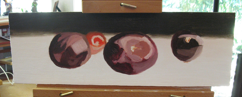
but i'm back now, and present: Cherries - the block-in

actually, i'm going to backtrack and start from the beginning. so far this painting has engendered some firsts for me, including creating a support from scratch, & i want to include you in my journey through them!

i didn't have a prepared canvas that was the right proportions for my crop of the original pic (which you'll find in the previous post). i did have a large piece of very nice 1/4" 3-ply plywood, so i cut an 18"x6" piece with my trusty circular saw (with my son supervising - i am totally scared of power tools). i took a fine-toothed rasp & filed the edges smooth, then wiped it down with a barely-damp cloth.

when it was dry, i gessoed it. i put a couple of sticks of wood down on newspaper to hold the support up (otherwise it sticks to the paper when it's dry - thanks to my partner for that hint!). i first put down some blobs of gesso, then used an old 2" hardware-store bristle brush (you'll see it a couple of pics down) to spread it evenly, ending up with strokes going along the grain (in this case, the long way). here i have a question for the other artists reading this - i used the gesso straight outta the bottle - but i've read that one should thin it with water first. what do you do? is what i'm doing ok?

here's the first coat on:


btw, if you're chemically sensitive as i am - the gesso may do you in! i had to do it with all the windows open & it was still really bad. i may try latex primer next time (as tho that'd be better?!), or i may end up having to use solely prepared canvases, which i really don't want to have to rely on (especially since i've learned how to cut supports myself!). anyone have any ideas? can one properly prepare a support using only oil paint - giving it a layer or two of, say, titanium white?

after the first layer was dry, i gave it a light sanding with very fine sandpaper (the back says, "220-c"?) which i just folded into a rectangle. i do have a palm sander, but i was concerned it'd take off too much. and it's a power tool.

then, on to the next layer - here are the blobs:


this second layer i finished with the strokes going down the short way on the support, which, when it dried, gave it a finish like a fine linen. i doubt i'll ever do so well again!! i finished the support by putting on a layer of titanium white. in the past, i've found that painting right on gesso seems to dull out the thinner layers of paint, so the finished surface is blotchy. but those paintings i've done over a layer of oil paint have all been uniformly glossy, like i like it!

here it is, all set to start (once it's dry, that is!)


i used transparent red iron oxide to do the sketch - i didn't thin it since i wanted it to not be too wet when i was ready to paint, so i tried to just use it sparingly. when i first got these paints i wrote to m. graham (they've been quite friendly!) & asked what to do about thinning underlayers (since with these paints, you use oil to thin) vs. fat over lean. they wrote back & said, basically, "don't thin the paint so much as paint thinly." so far, that's worked fine!

i used a 0 sable filbert for the sketching, which at first i did by eyeballing it. cue the Surfaris tune, Wipeout, 'cause that's what i had to do!

to do that, btw, i just put a bit of clean walnut oil on a paper towel & rubbed, then went over it with a dry portion of the towel. i also brushed it with a clean rag to make sure there was no towel lint left.

so then i started using every ruler & measuring stick i had, and doing a little math to figure out proportions & placement.


would a grid have been easier? probably! but i wanted to keep a more eyeballed look compared to the original. i marked where the center of the bottoms of the cherries would hit,


and then was able to sketch in the rest, including the highlights on the cherries & a hint of the shadows on the table.


today - the block-in!

i started by deciding which colors i was going to need and came up with:

alizarin crimson

transparent red iron oxide

cadmium red light

cadmium yellow light

phthalocyanine green

anthraquinone blue (first time using this one - i like it!)

i find this part really hard. i keep telling myself i should make color charts to better familiarize myself with the possibilities of all my colors, but . . .

overall, i think the colors worked for what i wanted to do. the green is in there since i wanted to put the barest hint of it in both the foreground table area & the background, to offset the red-purples of the cherries. i put a blob of white on my palette & added just the tiniest bit of thalo green (on the left).


hmmm . . . maybe for mint ice cream...

so i put a new blob of white down & added just a bit of the ice cream - perfect. using a 12 bristle flat, i put in the foreground. then i mixed the background. normally i try to use only two colors in a mix, three on the outside. but for this one, i went with four: alizarin, red oxide, thalo green, & the blue. after putting this in, i added some alizarin across the middle to give a bit of movement to it (i hope!). these are all transparent colors, which i like to use for backgrounds. i used a 10 flat bristle for this stage.


then- the cherries themselves. i used a base mix of the alizarin & trans red for the darkest, in shadow parts of the cherries, keeping them transparent. for the light-struck & highlight areas, i added either the foreground color (in some cases mixed with a bit of trans red) or straight white, depending on what was needed. i mixed a bit of the yellow into the cad red light to gt a base color for the bright cherry behind the others, and used white or the foreground color (mixed with some trans red) for its shadowing & highlights.

i started out using a 6 flat bristle, but really didn't like the way it interacted with the board for the texture of the cherries. i switched to a 4 sable (i think it's a flat; it's unmarked) - my first time using a sable in a painting! and i loved it! oooo - the feel of the paint going down so sensuously - wow! that's something i wanna do some more!

and here it is - the initial block-in:


whew! tomorrow (i hope!), i can start refining it - & i have a little list!

- work the table surface so that it moves back as it recedes from the viewer

- put in the shadows, reflections, reflected colors on the table surface

- make sure the background isn't stagnant, which i think it is

- work on the color of the bright cherry

i asked my son to check the block-in out (he has a great sense of color & composition) & he said the color of that one was wrong - it had no purple in it. sure enough, when i checked my palette


i realized he was right! (the colors for that one are the bright ones on the left.)

after all that's done, i'll see what i want to change with the other cherries. knowing me, i'll smooth out the color gradations at least a bit. then the centers & stems & we'll see what we all think!

thank you for stopping in!

till next time-

dusty!


Tuesday, July 13, 2010

Cherries - Initial Sketch-In

hi there!

whew! got the initial sketch-in done for the rookiepainter challenge (due the 19th!). this is how i cropped the picture for this month:

it took me 2 hours - & i'm exhausted! (hmmm . . . wonder if i could figure out how to paint laying down instead of sitting?!!) so i will just post the final initial sketch-in i did, and, hopefully tomorrow, i can post a few more pics & talk more about the process i went thru to get here:


this was a really interesting experience! first there's my usual trepidation about starting a painting (the way i put it in a twitter post was, "have to stop thinking of the blank canvas as sacred space whose purity i'll mar with a single stroke!"). then there was knowing that i wanted to post this stage - before i know what the final painting will look like! all those fears . . . what if i can't do it? what if it comes out terrible? etc etc!

but i just decided that the best way to learn - and for me to demonstrate learning - is to, well, just do it & see what happens!

thanks for checking in - take care!

dusty!

Monday, July 12, 2010

My Studio

hi there!

today i wanted to show you my studio - first, so you can get an idea of where i paint (so when i tell you i tripped over the easel yet again, you'll know where i landed!), & second so that i can share my experience with you, in case it proves helpful!

here is a basic view of the studio area:


it took me nearly the whole two years i've been painting to come up with this configuration - & it really works! it's so much easier to start - & to finish! - a painting project with all this room to move in, work area to spread out on, & supplies in one place!

at first, i wanted to locate my studio where there's north light - what it seems everyone says is the best. but unfortunately, the only window in my house with north light was in a small dark corner of the living room. i could hardly see, even in bright sunlight. so that didn't last long!

then i set up in a corner of my bedroom. two windows - one south & one west - gave lotsa light, except during the 6 months of winter. or when it was foggy. or...


this was taken on a particularly bright day, too! and that was about all the room i had to move around in. the easel i was using then - a mabef (in the lower right of the photo) - was somehow too unsturdy for me - maybe i attack the canvas too energetically!

finally, i moved into the present space in what i call the front room (which, yes, is located at the back of the house!). i have lots of room, storage areas, & work surfaces. (the windows, btw, face west) Here's my work area set-up:


i have a new mabef - it's a french-style box easel that folds up like a suitcase for doing plein air paintings, & is much sturdier for me than the old one - i love it! it also holds all my paints

which frees up a lot of tabletop room. i have them sorted by opaques on one side, transparents on the other. oh - that little vial of green to the right of the big tube of titanium white? that's chromium green oxide. m. graham, that i know of, doesn't make that color. but you can purchase the powder (my son got it for sharpening his straight-edge razor!), then mix it with walnut oil to make your own color! that was fun!

btw, you don't actually need all those colors! i'm kinda obsessive/compulsive, & would dearly love to own every color they have! & i really enjoy experimenting with different combinations of a basic palette (prussian blue, alizarin crimson, & cad yellow -or- cad red light, cad yellow light, & cerulean blue, etc) depending on what i'm painting. (& a giant thank you here to my dear cousin & to a special friend in illinois, who both sent me amazon gift certificates, & my amazing partner - all of whom made it possible for me to have the easels & my wonderful paints!)

the furniture is important. you need lots of space for storage! canvases, both prepared (which i'll talk about in a later post) & new; other tools (circular saw, drill, metal hole punch etc - another post!); papers & sketches; still life objects & materials; painting supplies (extra oil, gesso, etc) all take up a lot of room, but you need them handy & organized. if you look under the table my palette & brushes are on, you'll see two two-drawer filing cabinets, which hold quite a bit! i also have a chest of drawers & a dresser (not in the photos but right there) for things that are larger & have to lay flat. my largest canvases (16x20 - and i can't wait to paint one that big!) are stored between the filing cabinets. in the first studio pic, you can see two more tables for work surfaces - plus i use under them for storage - still life shadow boxes under the low one, and boxes with smaller wooden supports of different sizes on the shelves of the tv stand.

here's a close-up of the active work area:

my palette is a large (12"x16") piece of 1/4" thick glass with rounded corners; a local glass shop cut it for me - and it was only $9something! - very easy to clean, even if you don't clean up until the paints have dried. there's the palette knife next to it for mixing colors, and at the bottom right you can just see the pliers i use to open stuck paint lids, and the level for adjusting the easel if i have to raise or lower it. oh - that thing holding the brushes? my homemade wet brush holder - a really helpful thing to have! you can buy 'em, but i'll describe how i made this one in a later post. the ball jar holds oil for cleaning the brushes - i'll talk about that later, too! everything is on a piece of plexi-glass-type stuff, to protect the tabletop.

you'll also notice i use a chair. with my health, i can't stand up to paint, so a chair is a must. i just recently got a 'rolly-boy' (otherwise known as a wheeled office chair!) that works great! i can move it up close, then roll way back to see what the painting looks like from further away. this morning i was even rolling around the whole area, going from one table to another as i prepared some canvases! (ok, ok, that was just for fun - but it was!)

take a look at this photo:

there - between the easel & the table - it's a digital picture frame: essentially a small monitor, and it's really helpful. the blue couch painting is from a manip i did on the computer using my graphics program (i use gimp, btw - free & i find it easy & intuitive to use). i just upload the manip to the frame & then use it as a reference while i'm painting. very handy!

another thing that really helps is a drying rack or two:

mine are on a wall in the dining room right near my studio. it's just a piece of molding (formed wood lengths you can buy at a hardware store or millyard, if you have them where you live) cut to length (they can do that for you at the store). it's mounted on the wall with small metal brackets, and makes a good place to keep wet paintings safe & out of the way.

there are two lamps, in addition to the overhead lights. the lamp on the tv stand is a combo of both florescent & incandescent, which gives a balanced light, which i use for still lifes if there isn't enough daylight to do what i want. the overheads are both, too, for balanced room light for painting. the tall black floor lamp is just incandescent to light the table.

this doesn't have to cost much - really! most of what you see is repurposed furniture from the rest of the house. my partner made the low table & the frame table, and the tv stand got freed up when our electricity surged & the tv started smoking! most of the other items come from thrift stores & yard sales, as do most of my frames. and frankly, you don't even need an easel when you're first starting. so that leaves paint . . . which i'll be addressing in a new post, soon! posts after that'll cover the other things i've mentioned, plus paintings from the past & ones i'm currently working on.

until next time - take care!

dusty!

Saturday, July 10, 2010

holy smokes i sold a painting!!

hi there!

i had some pretty exciting news today & i wanted to share it with you - i sold a painting! it was at a local gallery, and was bought just yesterday!

here it is - Three Oranges!


it was painted in response to this challenge

http://rookiepainter.blogspot.com/2010/02/challenge-one.html

the first one from rookiepainter.

this is the reference photo


and this is how i cropped it!


i deliberately cropped it so that there was little but the oranges for a couple of reasons. one - it was three days before the deadline when i discovered the challenge so i needed to get it smaller! and, i needed something that would work well composition-wise in a small format (it's 5"x7", on canvas). i find that, with my health, the most i can paint at a time is two hours, so i knew i had a total of 6 hours to finish it!

unfortunately i don't have any process photos for this one (i was painting too fast to take 'em!). i started with a canvas that had been toned in cadmium yellow light (it was fully dry when i began) in hopes that'd help set off the blue & also brighten the oranges. then i used charcoal to sketch in the placement of the oranges and worked the background in prussian blue (i find i tend to get the background in first, then work on the center of interest). i also tend to use transparents for the backgrounds & shadows of still lifes, and opaques for the objects & center of interest. this helps the background go back & everything else come forward - and i'm always surprised when that really works!

after that, i got the oranges where i wanted them (working from the shadow to the light after applying a middle-value orange overall), then worked some ultramarine blue in to brighten some of the background & help the eye move around the painting. whew!!

gotta say, it makes me wanna do more challenges! and - i can now say i'm collected throughout the state!! (well, i've sold two and they're in two different cities . . . ! who knows - 'oranges' may even end up outta state - makes it national, no?!!)

hope you enjoyed seeing this one - i'll miss it!

till next time (which will be about my studio!) - take care!

dusty!

Friday, July 9, 2010

Introducing Dusty Pines


in my heyday!

when i was a child, i created art using anything that came to hand - pastels, poster paints, homemade egg tempura, crayons 'n' coloring books (tho i could never stay within the lines!), paint-by-number kits (ditto!), old oatmeal boxes covered in newspaper papier-mâché - anything!

my first en plein air painting - at least, the plastic flamingos on the lawn were real!

mom got me a book of art & craft projects and we did every one of them - some of my happiest childhood memories are in this book!
then my health started going (i have multiple chemical sensitivity etc.) & i couldn't use glues, paints, crayons, etc.; all that was left were pencils. decades later, i discovered Betty Edwards' Drawing on the Right Side of the Brain and worked to improve my drawing skills. i had read somewhere that all "real" artists have to be able to draw hands (?!!), and was quite relieved when i found i could!


twenty odd years ago, i took a pencil drawing class. i enjoyed learning more about drawing (and the free child care!), and carved out time from children, working, and returning to school to practice.

but drawing didn't hold the allure for me that painting did, and i let it drift away.

then, two years ago, i discovered M. Graham walnut oil paints. wowie!! to thin the paints and to clean the brushes, you just use plain walnut oil - no toxic chemicals! what joy - after nearly 50 years, i could finally paint again!

these paints are a pleasure to use - the texture is sumptuous, they smell divine, and the colors - oh my! brilliant jewel tones, rich earthy shades, seductive transparents . . . the only downside is, they take a long long time to dry - 3 to 4 weeks is average. this does mean, tho, that i can paint wet-into-wet (or 'a la prima') nearly forever! (hmm . . . can 'a la prima' be 'forever'?!)

this came off my easel a week ago & still smells & feels wet!

since i can't take classes, i've been reading every teach-yourself oil painting book i can find through the library. the first one that got me to put paint on canvas (well, actually, gessoed cardboard - a good cheap way to start practicing!) was J. M. Parramon's The Big Book of Oil Painting. it had been so long since i painted, my childhood playfulness - and confidence! - had evaporated. so for my first 'real' painting, i copied one of his examples - and quite surprised myself!

this is painted using only prussian blue, burnt sienna, and titanium white

by the time i read Steve Allrich's Oil Painting for the Serious Beginner, i was ready to try painting en plein air (at least for part of the painting) - and with lotsa color!

you can see the corrugation in the cardboard in this one!

i also study paintings in local galleries, and ask zillions of questions on the open studios tours. (we have an amazing number of truly talented artists here, who've answered even my most basic questions - which has really helped me!)

this one really made me feel, "i can do this!"

as i keep painting, i'm gaining confidence! i've had a few paintings in the local gallery - and i even sold one! i will be offering paintings for sale here, especially as i build up my body of work.

i get so much joy from the whole painting process - the smell, the feel of the paint going on the canvas, solving composition & other problems, watching the picture take form - that it's like reclaiming an important part of my life. and the more i paint, the more things i want to paint!

if i have the photos of works-in-progress, showing the steps toward a finished painting, i'll post those too. i do still lifes, landscapes (both from photos & plein air), manips - pretty much whatever strikes my fancy. i mostly paint wet-into-wet, but sometimes i let a painting dry & do glazes (like the old masters did!). i don't, i think, have a clearly defined style yet, but i do sometimes say it's a combination of representational, surreal, and/or abstract! or maybe it's just that i still can't get myself to "stay within the lines"!

next post: a tour of my studio!