Sunday, September 19, 2010

Paint & Draw Together September Challenge - Puppy

or - "the coal black yeti from 4AM"! (hmmm . . . could make a good 50's drive-in movie . . .!)

hi there!

i've been recovering from the little sesshin i tried to go on, & didn't think i could get this one done for the paint & draw together september challenge in time. & in fact, i didn't! finished it at 4AM last night - tho i did send it in this morning with the prompting of my son, on the off-chance it might get posted!

this one was tough! it's my first animal, so fur, perspective, facial features were all challenges for me! this is the original photo:

i first tried an 8(h)x6(w) crop, but settled on a square 5x5 format close-up on canvas panel:

i gridded it & sketched in the main features. then - the fun part - mixing the black! i started with ultramarine violet & added a bit of alizarin & hansa yellow. it needed to be darker & less purple, so i added a bit of olive green & also prussian blue - got it to a really deep true black! very exciting, but problematic - it was transparent, but it had to be the main focus color! decided to press on since i liked it so much!

i blocked in the eyes (using some of the black, & adding white, alizarin, & olive green for the brown) & nose, and the main black highlights.


i then mixed up all the greys (using either white or naples yellow) & pinks, adding alizarin for the reds, and applied those.

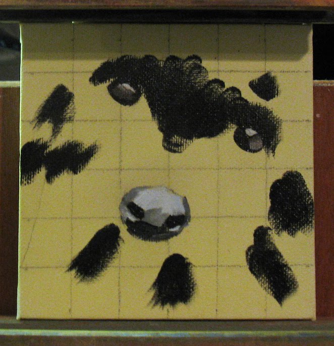
then it was 'just' a matter of reworking every detail! i used filberts for the fur, plus a flat, and fan brushes for the details of wisps of fur. i wiped the nose out out at least four times & am still not happy with it! i also had a lot of trouble getting the muzzle to show length, and - did i mention the nose?!! at last, i decided i couldn't do more & called it done!

this actually was a lot of fun - i loved getting in the highlights in the eyes & playing with the fur! & hey - not everyone gets to create their own new species!

thanks for stopping by - take care till next time!

dusty!

Tuesday, September 14, 2010

Daily Painters International Art Challenge: Music

hi there!

lately, i've not been able to comment on the blogs of folks i follow - i'm disabled, & sometimes i can't do much, either painting, blogging, or - worse! - reading & commenting on other blogs! i really miss being able to do that, & i'd like you to know that, when i've not been commenting for a while, i'll get back to it just as soon as i can!

today, i did have some energy - & i spent it painting! oh the joy of getting back to putting brush to canvas! i've been working in stages on the daily painters international art challenge for this month, which had a one-word prompt - music.

now, when i think of "music," the first thing that comes to mind is my friend, joseph byrd. joseph is one of the great, important composers of the 20th & 21st centuries. he also plays a mean accordion! so i decided, despite my never having painted a portrait before (& having drawn faces just a few times!), i'd do a painting of joseph.

to start, i did a manip in gimp to play with some ideas. i used a favorite photo of him, taken by H. R. LoBue of H. R. LoBue Fine Art Photography. it was a black & white, so i played with the colors & added a background. i put in some place-holder music, & then got a copy of a sheet of "Water Music," one of joseph's compositions, to paint in. in the end, though, i decided the music was too busy for the painting, & just did the portrait.

here's the original manip:

i chose an 11x14 canvas panel which had been toned with acrylic cad yellow light. (the color's not showing well in the photo, but it was pretty pale to begin with.) i did the grid then sketched in the portrait, with just the barest hints of features.

i wanted the background, hat, & coat to be earthy, sepia colors, so i started working with trans orange oxide, trans yellow oxide, naples yellow (for the right side), & burnt umber & a smidge of payne's grey (for the upper left corner).

then i put in the hat & coat, using mostly a combination of burnt umber & trans yellow oxide, darkened with a bit of payne's grey in places, & lightened by the orange oxide in others.

for the face colors, i chose hansa yellow (i think in other brands, lemon yellow would be the closest), indian yellow, permanent green light, alizarin, & prussian blue. i started putting in the pink, yellow, & orange, using burnt umber for the shadows & glasses frame.

then the greens & blues went in.

after that it was 'merely' a matter of getting the features just right. for the next three hours!! i worked on the face shape, the beard, the nose shadow, the shadow under the chin, the glasses frame, the shadow under the hat, the eyebrow, the placement of the colors to show facial structure, and - the eyes. getting his left eye just right - oh wowie! i think i redid it about eight times - and the highlights twice! but finally i was able to step back & say, hey! it's joseph!


i'm pretty excited about it! i've always felt that portraits were terribly daunting - & it was a lot of exacting detail work - but now that i've done my first, it's not quite so scary any more!

thanks for stopping by - take care till next time!

dusty!

p.s. i'll be gone from the computer wednesday through friday, so i'll be catching up on my blog reading - & commenting! - after that - see you then!

Wednesday, September 8, 2010

Mandelbrot Iteration #8

hi there!

i love fractals. they're so infinite, complex, endlessly fascinating. i have a program that will generate them called fraqtive (free open source program, if you get interested!). you choose all sorts of parameters, colors, etc to create them. you can then zero in on a particular section & explore!

this is one of my favorites of the ones i've created so far. it's full name is Normalized Iteration Count Algorithm 8! I call it The Red One:

i've been wanting to paint it for a while. when i finished the september plums i realized the colors i had on the palette would be perfect for it. so i took out a 5x5 dark-gold toned canvas, and sketched in some cad red light.

i decided i needed a darker blue, so i got out the ant blue, & lightened it with some white. to put in the black & green, though, i needed the paint to be more fluid. so i cleaned the brush, but didn't dry it as thoroughly as usual, leaving some walnut oil in it. this let me pick up the paint & spread it much more liquidly than usual. the green is sap plus white, the black a combo of ant blue, quin rose, and a hint of trans yellow oxide. i played with the shapes a bit & got both sides in.

then for the little curlicues on top. hmmm . . . i decided to go more playful than the original, and put in a series of dots. i did that, then changed the shapes of the black merging into the blue - and there it was!


i'm pretty happy with it, & am encouraged to paint more of my fractals. tho i wonder if i should come up with less computerese names for them, like 'cliffs at sunset' or something!

thanks for stopping by - take care till next time!

dusty!

oh - i meant to say - i hope this blog may prove useful to beginner painters like myself - if there's anything i can be doing to make this blog more helpful, please let me know! thanks!

Monday, September 6, 2010

Artists Helping Artists Challenge: September

hi there!

when i read the artists helping artists challenge, i tried to think of what i associate with september. to help, i went through my old camera files. and there was this wonderful picture of ripening plums from one of the trees in our backyard, taken by my son last september!

i was really excited to find this, for a number of reasons.

first - i've always wanted to try a painting with a very dark background & just the center of interest lit. this would give me a chance to try that out, as well as practicing controlling values in order to get some leaves appearing just out of focus in the dark background.

second, i've been feeling like i've been using a lot of white lately, which has been unusual for me. i love my m. graham paints so, i tend to want to use them pure mixed only with each other if necessary, not white! so this offered a chance to use as little white as possible.

third, i've not done much with leaves, especially profusions of them, & i wanted to see how i'd handle that! in some ways, painting is like writing - you don't know yourself until you do it!

so i set up the grid in front of the digital frame, marked a grid on the 8x10 gold-toned canvas i chose, and sketched in the basics with a bit of charcoal.

after wiping away the grid lines & dusting off the excess charcoal from the sketch, i laid out my colors.

i love alizarin, but decided not to use it - i wanted to explore some other reds i'd not tried much. i also decided i'd need pretty much every green i had to pull this off without white. but i did need something opaque to lighten the greens, and to accentuate the center of interest.

for those, i chose cad yellow light and naples yellow. i added trans yellow oxide to brighten the deeper reds, if necessary. the reds were cad red light for the opaque parts, and quinacridone rose & red for the shadow areas.

the greens were veridian, phthalo (for its blueness), sap, and olive (for its wondrous darkness!). i also put out ultramarine violet, planning on mixing it with the olive green for the transparent background. and here they all are:

this arrangement of colors still seems to be working really well - keeps 'em separated & also allows lots of room in the center & along the other edges for mixes.

i put an initial layer of color down for the plums, using the quin rose for the shadows, the quin red for the transitional areas, and the cad red light for the brightest areas. i mixed a small small bit of all of those with a lot of white for the highlight & lay it in.

then the background - for which i had a plan! on the outer areas of the canvas, i used a mix of lots of ultramarine violet with some olive, figuring the purple tone would compliment the green leaves. closer in to the plums, i used the same mix, but with mostly olive green, to compliment the reds in the plums. they look nearly the same, not only in the photos but on the canvas, but i feel it did make a difference.

here's the plums initially in & a start on the outer background:

i got the rest of the background initially in, then started playing around with straight olive green with bits of this & that to see what would show up, but barely, against the background. here's the first few back-most leaves in:

i decided the phthalo would be good for those leaves emerging from shadow but not fully in the light, and used both cad yellow light & naples yellow to modify it. then sap green and a very little veridian, also modified with the yellows, made up the rest of the leaves. the brightest leaves were sap green and cad yellow light. i refined the plums a bit & stood back for a look. (this photo is a bit bright - i had an amazingly hard time getting good photos of this painting - probably because the dark background was wreaking havoc with the auto settings on my camera! and i also managed to get some blurry photos - using the tripod!!)

i saw some areas i wanted to improve - the highlights on the plums & the too brightness of some of the background leaves - & my son pointed out that the leaf & bit above the plums were too light. after fiddling with the values some more, i got it looking the way i'd envisioned it! (and then spent a few hours trying for a good photo!) here it is, finished!

i'll be submitting it to artists helping artists (pretty cool site, btw!) tonight & start the next challenge that's due the 15th - daily painters international: music! also, i'll soon be posting an abstract that i did!

this one & the abstract both went well, so well that i had to keep reminding myself to pause now & then to take a photo for you to follow along - that's the kinda painting time i like - when you feel that putting paint on canvas is one of the best things that could ever happen to you!!

thanks for stopping by - take care till next time!

dusty!

p.s. just checked out the other submissions for the aha challenge - they're all so very good! - & my little plums are going to join them - oh dear! quite nerve-wracking! *gulps*!


Wednesday, September 1, 2010

Virtual Paintout Challenge: Prince Edward Island

hi there!

this time i finished the virtual paintout before it ended! and it really was a challenge! except for the sailboat painting, i've never done ocean, & few landscapes . . . plus i decided it was time to loosen up!

first, this is the view on prince edward island that i chose:

i liked the simplicity, the opportunity for abstraction, and the play of rosy pinks against purpley blues. here things are, ready to go:

i used a 5x7 canvas board (untoned), put the photo up on the frame, and laid out my palette, using ultramarine, cerulean, sap green, trans yellow oxide, cad yellow light, cad red light, & alizarin:

i tried a new way to organize the paints - i put the white in the upper left corner as usual, but i put the reds & yellows going off to the right on the top & the blues & greens going down the left. i really liked it - seemed a natural way to arrange them for me, & it kept the colors well separated, too! i'll keep trying it this way for a while.

i started to mix the sky color first, using cerulean & white, with a tidbit of alizarin. but before i got the colors really mixed, i thought about using painting knives instead of brushes. i've done only one painting before this with knives only, & loved it! so, just to make this even more of a challenge (mere hours before it was due!) - i decided to do it! here's the sky mix (which i kept marbled instead of mixing it to a consistent color - same with the water mix later on) & the knife (brown handle) i used to put it on:

then i mixed the water color (ultramarine & white) & put that in with the same knife. here is the initial block-in - i've left the canvas blank where the dune was going:

then i mixed up the sand bar color, using alizarin, white, & a smidge of trans yellow. i used this little guy to lay it in - this knife felt like a filbert to me & i thought the shape would work well for putting in that long strip of color - & it did!

then i mixed the dunes mix, using some of the sand bar mix with more white & a touch of cad red light to brighten & warm it up. i used this little triangular knife to lay in all the rest of the painting, including all the details of plants & shadowing, etc that came later:

here're all the blues & pinks in. i didn't put any paint where i was going to put in the largest mass of green for the dune plants: i hadn't done any measurements, & at this point i realized the sand bar was way too wide. so i just used the knife to lift it off & lay in more ocean. then i mixed up four different greens (using my lightest pink for the base of the light greens), some lighter or darker, some purer or greyer. & i realized the sap green wasn't going to cut it for the darkest greens. ooops! got out the olive green & that worked! i also decided the sand colors needed a hint more depth, & added hints of burnt sienna to the bar & the darker dunes. the water behind the sand bar i darkened using anthraquinone blue (if it's ok with you, i may just start calling this 'ant blue' - i'm lazy, & it's fast becoming my favorite blue!)

i then had to put in the clouds. i realized that the horizontal clouds of the photo just wouldn't work - too many horizontals (that sand bar's a whopper, even though it looks better in person than in the photos!). so i decided to go for a fluffy cloud approach. first i mixed up a black to get in the darks. i used the ant blue with alizarin, & a teeny hint of trans yellow oxide - very nice, deeply purple black, just right for the clouds! (this is an awful photo, but it gives you an idea, i hope!). i mixed a small amount of it with white, & worked it in where i wanted clouds.

then i dipped the knife into pure white, strolled it very lightly through the ant blue (leaving a trail behind it!)
and worked in the lighter parts of the clouds. by the way, you can see in the above photo the trail left in the olive green when i slid the knife lightly through it to get just a thin line of paint to make some dark highlights. i love how versatile the knives are, going from smearing on huge masses to fine detail (well, it'd've been finer if my hands didn't shake!).

here's what my palette looked like when i was done. i didn't end up using the cad yellow light at all. i really am finding that the more i paint, the more i experiment with my colors & find out which ones work better for me.
and here it is all finished! (it's hard to get a good photo on this one, since the masses of paint keep picking up &/or shadowing the light!)

i had a lot of fun with this one! it's got that looser, more abstract, interpreted style i feel i want to express in my work, & the painting knives made it easier & even more fun! i really like the clouds - they have volume but are also fluffy - they float as they should! (i have been terrified of trying clouds in the past!) the dunes worked well, along with the plants. the water i'm so-so on - and the sand bar . . . well, i knew it would be hard to get that strong horizontal to work. i think it needed some more variation in color to really pull it off - and a steadier hand to get in the light & dark tones right in the front of it (i tried, but it was too shaky to look very good so i modified it a bit). all in all tho - i like it!

thanks for stopping by - take care till next time!

dusty!