Showing posts with label still life. Show all posts

Tuesday, October 19, 2010

LEMON STILL LIFE

hi there!

i finished! i'll start from the beginning, way back in september . . .

this was originally for the rookie painter challenge due last month - here's the photo prompt they posted there:

i have to admit, when i first saw it, i kinda shrugged it off. i didn't see anything exciting there; despite my admiration for artists who can portray that wonderful translucence in the citrus fruits, i just didn't feel this one was for me.

but then i looked at it again - and saw these wonderful blocks of color, especially in the shadows - and it clicked! i would do it exactly as i saw it - in distinct color blocks. i also saw more, warmer reds in the yellows of the lemon, & realized it'd make a nice contrast if the background & foreground were cooler. i also decided it had to be big to really show up the color blocks. looking at what i had on hand, i chose a 12x16 art board (only the second time i've painted that big!). ok - challenge on!

i put the photo on the digital picture frame, then went to sketch it in. easy-peasy, thought i - just a few curves and . . . err . . . that main part of the lemon kept coming out flat & wobbly - and i couldn't get the receding aspect on the slice at all! so, i gridded up the board, place my lucite grid in front of the frame, and sketched it in - & that worked fine!

for the shadows, i kept the sketch simple, but i made sure to get the lemon details fairly exact to get the right relationships between inside rind, outside rind, & pulp.

i wanted the background to stay cool so i chose prussian blue, anthraquinone blue, and ultramarine violet along with the titanium white. these colors were looking really 50s to me, & i liked 'em!

then i brought out the olive green & hansa yellow to get the color for the table. for the darkest shadow spots, i used alizarin crimson with what i already had out. the lighter shadows were combinations of the blues, green, and dark along with white. i loved the shadow areas, especially on the slice - there's light coming from all directions (well, maybe just two or three!) in the photo, and that made the shadows there complicated & interesting.

one thing i did that i think was important & helped keep the colors clear was that i was careful to not overlay the colors - the blocks of each color are the only thing there, with no (or as little as i could get myself to do!) blending.

i was pretty happy with it - it was hard to not blend the blocks of color in the shadow under the larger portion of lemon, but i felt it still represented what i wanted to do.

and there it sat. starting the next day, i had to go for numerous medical tests (don't worry - everything's fine for now!), and it took me much longer than i thought it would to recoup my former levels of energy & interest. but finally!

after catching up on all your blogs & wonderful paintings, i felt ready! without thinking about it, i put out naples yellow, indian yellow, transparent red iron oxide, and viridian along with white. these gave me light, warm, and red-tinged values to play with - & play i did! what fun, just laying down the colors!

earlier yesterday, nancie johnson had commented, "I think you'll enjoy the new vision you'll gain on painting shapes & colors (I did!)" & boy was she right! it was like stepping into an infinte, newly remade wide-open world of color & light!

in fact, i was having so much fun, everything just flowing from the end of the brush onto the canvas - that i realized when i was done (which was a sudden & surprising moment) i'd not taken any photos of the process! but in general, the naples yellow (with or without white) was for the lightest areas, then the indian yellow in combo for the midtones, and trans red added for the shadow areas. the lemon pips are straight trans red - couldn't resist! the nobbule on the end of the lemon is viridian mixed with white & naples yellow, and lighter versions of that, with lots more naples & white, are in the green tones in the pulp of the lemon slice.

and here it is:

it's rekindled, after being away from painting for so long, my joy in seeing-like-an-artist ("ooo - greens in the pulp! reds in the skin!") & painting. i feel this painting has a lot more 'me' in it than some i've done recently & i'm really happy with it!

oh - i'm trying something new - i got a bottle of m. graham's walnut alkyd medium, to see if i could use it, given my chemical sensitivities. it seems that as long as i don't stick my nose in the bottle & inhale (my usual test - you should see me trying to find a glue i can use!!), it's ok. i'm hoping it'll help the paint dry a bit faster, especially with winter coming up. the thing is, the paint went on thinner & more transparent (i used just one or two drops for my little blobs of paint, and 4 drops in the 1" long strip of white), so i'll have to keep experimenting with it.

well, that's it for now - off to do some blog reading & commenting - then deciding what to paint next. there's a number of new challenge projects (i've added more links in the box to the right) that are intriguing. the aspens of the wilderness art challenge would give me practice in doing landscapes, which i really want to learn. but the daily painters international - black & white plus one color - sounds yummy! or, i may just put together a still life at home!

thanks for stopping by - take care till next time!

dusty!

Sunday, October 17, 2010

A Quick Note . . .

. . . to let you know, i'm back! that is - all recovered 'n' rarin' to go! right now, i'm catching up on commenting on all your wonderful blogs, then - i'll finish that poor lonely lemon from last month's rookie painter challenge! i'm really excited about checking in with all of you & seeing what you've been up to!

i'll be posting again as soon as this yields to my brush! here's where it's been this past month:


this is the original prompt:

i'm going for something new-to-me - just placing in the blocks of color & playing with the juxtaposition of the cool background/ground colors vs. the warm yellows, oranges, & reds that'll be showing up on the lemon.

when i do finish it, i'll also be posting it on daily painters international - i've decided it's time to get more serious about selling my work! i'll be adding a new label - "available paintings" - to those paintings i feel are ready to go out in the world! if you're interested in any of them, please email me (dustypinesart@gmail.com) - i haven't yet figured out ebay &/or paypal, but hopefully i will soon!

see you on your blogs & back here real soon!

thanks for stopping by - take care till next time!

dusty!

Thursday, August 12, 2010

My Homemade Brush Holder & 2 Paintings, Framed


When i first started to paint, i had a lot of trouble figuring out what to do with brushes that were loaded with paint, but that i didn't want to clean until i was done with them. i tried the classic hold-them-in-your-hand with your palette, but kept crashing into the walls (yup - my other studio spaces were that small!), getting the paint from one brush onto the next, &/or dropping them on the floor. a friend gave me an art supplies catalog, & in it i saw the answer to my problem - a brushholder! trouble was - it was too expensive, especially with shipping. so i kept schmeering paint on the walls & picking cat hair off the bristles as i painted.

Sometime later, my son tossed out an old lamp he had. It had a curved plastic shade - & looked just like the brushholder to me! i salvaged the shade & explained what i wanted to my son. he taught me how to use his dremel tool with the sander attachment, and i made little scoops in the shade to hold the brushes. (if you do this be careful - it can really get away from you fast!) i made one of the scoops larger for bigger brushes.

then he heated up his hot glue gun (i can't use glues myself because of the chemical sensitivities), and glued the shade to a piece of wood i'd found floating around the garage. (you can find virtually anything in my garage - in fact, i believe if you look hard enough you'll find the engine for a 1986 subaru somewhere - or is it an '84?)

the scoops were a little slippery for the ferrules of the brushes, so he lightly coated the inside of the cups with a bit of rubber cement.

this works incredibly well - you can see it in action below. you just rest the brushes bristle-end in - it keeps them secure, separated, and off any surfaces you don't want coated in paint! if you can find anything that would work, i'd suggest doing this.

in other news: the two paintings (blue & brown couches) i had at the local gallery haven't sold, so tomorrow i'm going to bring him these two, & see if he'll take 'em. maybe folks'll like these better!!


thanks for stopping by - take care till next time!

dusty!

Tuesday, July 27, 2010

The Evolution of a Painting

hi there!

i wanted to take you through the process of creating what i think is my most successful painting to date - i totally love this one!

it all started one day when my son brought home some day-old baked goods - which included this delicious item!

i actually did ask permission to take it - tho, yes, i promised to give it back when i was done! (unfortunately, it was pretty stale by then, & the dog got a yummy treat!)

i tried sketching it in pencil, but just couldn't get something i liked. so i took out my trusty camera & starting shooting away, putting the plate on various surfaces. when i got the above photo, i knew it was right - the background colors set off the main yellows of the center of interest really nicely!

i then decided on which paints to use. i don't know why i do this in advance, except (a) i have way too many colors & have to narrow them down from the git-go! & (b) this is when i really study what i'm painting, looking at all the colors in the body, foreground, background, highlights, & shadows. this is what i came up with - more than i usually use (i normally stick to about 5), but i felt i needed a wider range of reds & yellows for this one.

i had been reading some daily painters' blogs online by then, and saw that one of the most frequent sizes used was 5x7. so i chose a 5x7 canvas, and toned it with cad yellow light. when it was dry, i did the sketch-in, first lightly with charcoal & then using terra rosa. i had a lot of trouble (as always!) with proportions and placement - and, if you enlarge the pic, you'll see an area that's all shiny - that's where i dampened a paper towel with walnut oil & erased some of the sketch! i put in the main forms & all the shadows - and liked it!


next i put in the table & background. i chose alizarin for the main color for the table, and prussian blue for the background. these two tend toward purple (at least how i see 'em & experience them!), so i thought they would nicely compliment the yellows of the center of interest. i worked them around a bit, adding this & that until i liked the texture of the colors, and called them done.

the plate came next - i had to lighten up what was there, and add the beginnings of shape, shadow, & highlights for both the plate & the treat. this became my first block-in:

"all" that was left was to complete the yummy center of interest. i switched to opaque colors to be sure it held the attention i wanted it too. i worked away on the frosting, filling, and main shape, concentrating on the shadows &, lastly, the highlights. (altogether, it took me 4 painting days of my usual about two hours a time.) and here it is!

looking back on it, i really like the way the plate came out, with its shiny parts & the deep yellow for part of the shadow. and also the composition, with the edge slightly cropped & it filling so much of the space.

i found the perfect frame for it - the blue really does good things for it!

thanks for stopping by - take care till next time!

dusty!

Sunday, July 18, 2010

Cherries - Finished!


i'm happy with them! here it is (i know - the suspense was getting to me too - like an old-fashioned cliff-hanger!):

i don't have any process photos, but i do have two close-ups of each set of cherries, so you can see the little areas the stems come out from and the stems, which are what i did today:


the stems were very hard for me - my hands shake (i think it's genetic; my dad & son have it too) & i needed to use goodly blobs of paint for them so it would lay on top of the previous, still wet, paint without picking up the reds & purples. but it turned out i needed to q-tip only two of them!

at first i used my trusty 0 sable filbert, but it lay down too thick a line. then i tried the long edge of the 4 flat sable & that worked well. i also used both those brushes to do all the details of the little petal-type things at the stems' bases, as well as adjust the colors of the main cherry. i realized, once the stem was on it, that i'd not gotten the colors right to indicate the cherry's roundness in the center and the shadowing on its lower left, and also that the highlights had to be crisper.

i submitted it to rookiepainter & it's up already! the other paintings are really wonderful! and such a range of interpretations! check it out here:

http://rookiepainter.blogspot.com/

i'm looking forward to the next challenge! it was an interesting experience, developing the picture while others watched, not knowing if i could do it or not! i'm really glad i did, tho!

next up for me? i have a photo of a dog i want to try (haven't painted animals yet!) - but a much smaller format - 4" square! can i paint that tiny with my shaky hands? can i do fur at all? will it even look like a dog?! stay tuned!

thank you all for stopping by & for your great support! and if you have any critiques, please let me know - all responses are very welcome!

till next time - take care -

dusty!

Friday, July 16, 2010

Cherries - Second Stage

hi there!

i didn't expect to have time to paint today (fridays are my day to hang out with my son) but i did!

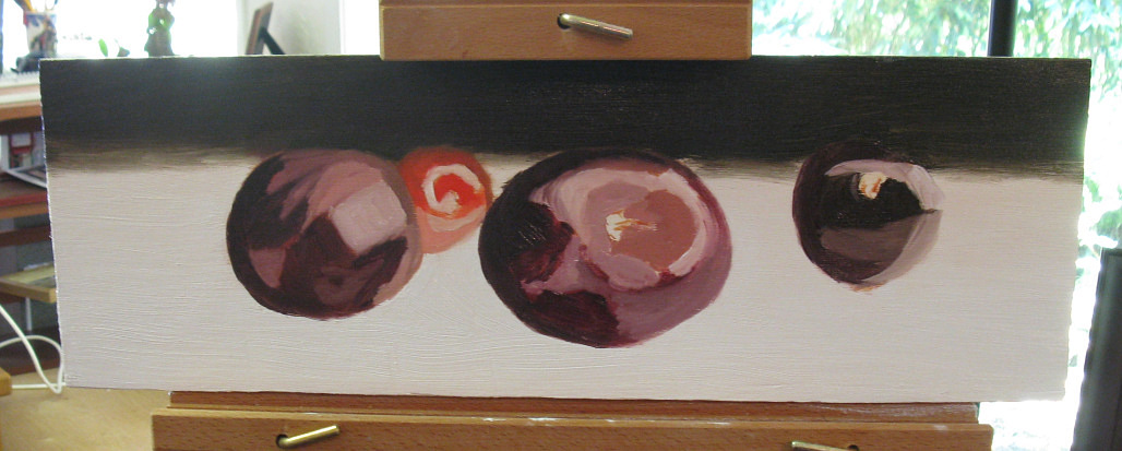
i decided to address a couple of the points i listed yesterday - the foreground & the shadows, & making those purple balls look like three-dimensional cherries!


(there's some reflection off the dark background paint i couldn't eliminate in the photo.)

i'm much happier with it, except for the little cherry in the back. i ended up scraping it out at least four times!! once with the palette knife, the other times with q-tips, which not only worked better, but left a nice base for me to build on. it needs more work tomorrow - the highlight has to be lightened, but i'm feeling this one is almost done. just have to finish the *grumble grumble* little cherry, put on the stems, do some final adjustments . . .

before i started, i realized i was having that same old feeling: oh, i'll just make it worse. i won't be able to figure out what it needs. etc etc. till i just got up, took out my palette, picked up a brush, and started gooping paint onto the foreground just for fun. and then it was fun! playing like that allowed me to let go of all the hesitations & just work on it. before i knew it, two hours had passed & i could go no further. but what a joy it was today! (and thank you all for your encouragement!)

even the little cherry - took me forever to figure out what i was doing wrong - should not have used the cad red light, but rather stuck with the alizarin, which makes up the base of the others. i also darkened the big cherry on the left (by adding some of the blue to the alizarin) and reddened (using more alizarin) the main cherry, to bring the focus fully where i wanted it.

and that's it! observing, analyzing, learning my paints - and letting go & having fun!

till next time - take care -

dusty!

Thursday, July 15, 2010

Meanwhile, back at the ranch . . .

when we last saw dusty, she was tied to the railroad tracks . . . luckily, along came jones to rescue her!


(please note: the lady in the picture is not me - my hair is much shorter.)

but i'm back now, and present: Cherries - the block-in

actually, i'm going to backtrack and start from the beginning. so far this painting has engendered some firsts for me, including creating a support from scratch, & i want to include you in my journey through them!

i didn't have a prepared canvas that was the right proportions for my crop of the original pic (which you'll find in the previous post). i did have a large piece of very nice 1/4" 3-ply plywood, so i cut an 18"x6" piece with my trusty circular saw (with my son supervising - i am totally scared of power tools). i took a fine-toothed rasp & filed the edges smooth, then wiped it down with a barely-damp cloth.

when it was dry, i gessoed it. i put a couple of sticks of wood down on newspaper to hold the support up (otherwise it sticks to the paper when it's dry - thanks to my partner for that hint!). i first put down some blobs of gesso, then used an old 2" hardware-store bristle brush (you'll see it a couple of pics down) to spread it evenly, ending up with strokes going along the grain (in this case, the long way). here i have a question for the other artists reading this - i used the gesso straight outta the bottle - but i've read that one should thin it with water first. what do you do? is what i'm doing ok?

here's the first coat on:


btw, if you're chemically sensitive as i am - the gesso may do you in! i had to do it with all the windows open & it was still really bad. i may try latex primer next time (as tho that'd be better?!), or i may end up having to use solely prepared canvases, which i really don't want to have to rely on (especially since i've learned how to cut supports myself!). anyone have any ideas? can one properly prepare a support using only oil paint - giving it a layer or two of, say, titanium white?

after the first layer was dry, i gave it a light sanding with very fine sandpaper (the back says, "220-c"?) which i just folded into a rectangle. i do have a palm sander, but i was concerned it'd take off too much. and it's a power tool.

then, on to the next layer - here are the blobs:


this second layer i finished with the strokes going down the short way on the support, which, when it dried, gave it a finish like a fine linen. i doubt i'll ever do so well again!! i finished the support by putting on a layer of titanium white. in the past, i've found that painting right on gesso seems to dull out the thinner layers of paint, so the finished surface is blotchy. but those paintings i've done over a layer of oil paint have all been uniformly glossy, like i like it!

here it is, all set to start (once it's dry, that is!)


i used transparent red iron oxide to do the sketch - i didn't thin it since i wanted it to not be too wet when i was ready to paint, so i tried to just use it sparingly. when i first got these paints i wrote to m. graham (they've been quite friendly!) & asked what to do about thinning underlayers (since with these paints, you use oil to thin) vs. fat over lean. they wrote back & said, basically, "don't thin the paint so much as paint thinly." so far, that's worked fine!

i used a 0 sable filbert for the sketching, which at first i did by eyeballing it. cue the Surfaris tune, Wipeout, 'cause that's what i had to do!

to do that, btw, i just put a bit of clean walnut oil on a paper towel & rubbed, then went over it with a dry portion of the towel. i also brushed it with a clean rag to make sure there was no towel lint left.

so then i started using every ruler & measuring stick i had, and doing a little math to figure out proportions & placement.


would a grid have been easier? probably! but i wanted to keep a more eyeballed look compared to the original. i marked where the center of the bottoms of the cherries would hit,


and then was able to sketch in the rest, including the highlights on the cherries & a hint of the shadows on the table.


today - the block-in!

i started by deciding which colors i was going to need and came up with:

alizarin crimson

transparent red iron oxide

cadmium red light

cadmium yellow light

phthalocyanine green

anthraquinone blue (first time using this one - i like it!)

i find this part really hard. i keep telling myself i should make color charts to better familiarize myself with the possibilities of all my colors, but . . .

overall, i think the colors worked for what i wanted to do. the green is in there since i wanted to put the barest hint of it in both the foreground table area & the background, to offset the red-purples of the cherries. i put a blob of white on my palette & added just the tiniest bit of thalo green (on the left).


hmmm . . . maybe for mint ice cream...

so i put a new blob of white down & added just a bit of the ice cream - perfect. using a 12 bristle flat, i put in the foreground. then i mixed the background. normally i try to use only two colors in a mix, three on the outside. but for this one, i went with four: alizarin, red oxide, thalo green, & the blue. after putting this in, i added some alizarin across the middle to give a bit of movement to it (i hope!). these are all transparent colors, which i like to use for backgrounds. i used a 10 flat bristle for this stage.


then- the cherries themselves. i used a base mix of the alizarin & trans red for the darkest, in shadow parts of the cherries, keeping them transparent. for the light-struck & highlight areas, i added either the foreground color (in some cases mixed with a bit of trans red) or straight white, depending on what was needed. i mixed a bit of the yellow into the cad red light to gt a base color for the bright cherry behind the others, and used white or the foreground color (mixed with some trans red) for its shadowing & highlights.

i started out using a 6 flat bristle, but really didn't like the way it interacted with the board for the texture of the cherries. i switched to a 4 sable (i think it's a flat; it's unmarked) - my first time using a sable in a painting! and i loved it! oooo - the feel of the paint going down so sensuously - wow! that's something i wanna do some more!

and here it is - the initial block-in:


whew! tomorrow (i hope!), i can start refining it - & i have a little list!

- work the table surface so that it moves back as it recedes from the viewer

- put in the shadows, reflections, reflected colors on the table surface

- make sure the background isn't stagnant, which i think it is

- work on the color of the bright cherry

i asked my son to check the block-in out (he has a great sense of color & composition) & he said the color of that one was wrong - it had no purple in it. sure enough, when i checked my palette


i realized he was right! (the colors for that one are the bright ones on the left.)

after all that's done, i'll see what i want to change with the other cherries. knowing me, i'll smooth out the color gradations at least a bit. then the centers & stems & we'll see what we all think!

thank you for stopping in!

till next time-

dusty!


Tuesday, July 13, 2010

Cherries - Initial Sketch-In

hi there!

whew! got the initial sketch-in done for the rookiepainter challenge (due the 19th!). this is how i cropped the picture for this month:

it took me 2 hours - & i'm exhausted! (hmmm . . . wonder if i could figure out how to paint laying down instead of sitting?!!) so i will just post the final initial sketch-in i did, and, hopefully tomorrow, i can post a few more pics & talk more about the process i went thru to get here:


this was a really interesting experience! first there's my usual trepidation about starting a painting (the way i put it in a twitter post was, "have to stop thinking of the blank canvas as sacred space whose purity i'll mar with a single stroke!"). then there was knowing that i wanted to post this stage - before i know what the final painting will look like! all those fears . . . what if i can't do it? what if it comes out terrible? etc etc!

but i just decided that the best way to learn - and for me to demonstrate learning - is to, well, just do it & see what happens!

thanks for checking in - take care!

dusty!

Saturday, July 10, 2010

holy smokes i sold a painting!!

hi there!

i had some pretty exciting news today & i wanted to share it with you - i sold a painting! it was at a local gallery, and was bought just yesterday!

here it is - Three Oranges!


it was painted in response to this challenge

http://rookiepainter.blogspot.com/2010/02/challenge-one.html

the first one from rookiepainter.

this is the reference photo


and this is how i cropped it!


i deliberately cropped it so that there was little but the oranges for a couple of reasons. one - it was three days before the deadline when i discovered the challenge so i needed to get it smaller! and, i needed something that would work well composition-wise in a small format (it's 5"x7", on canvas). i find that, with my health, the most i can paint at a time is two hours, so i knew i had a total of 6 hours to finish it!

unfortunately i don't have any process photos for this one (i was painting too fast to take 'em!). i started with a canvas that had been toned in cadmium yellow light (it was fully dry when i began) in hopes that'd help set off the blue & also brighten the oranges. then i used charcoal to sketch in the placement of the oranges and worked the background in prussian blue (i find i tend to get the background in first, then work on the center of interest). i also tend to use transparents for the backgrounds & shadows of still lifes, and opaques for the objects & center of interest. this helps the background go back & everything else come forward - and i'm always surprised when that really works!

after that, i got the oranges where i wanted them (working from the shadow to the light after applying a middle-value orange overall), then worked some ultramarine blue in to brighten some of the background & help the eye move around the painting. whew!!

gotta say, it makes me wanna do more challenges! and - i can now say i'm collected throughout the state!! (well, i've sold two and they're in two different cities . . . ! who knows - 'oranges' may even end up outta state - makes it national, no?!!)

hope you enjoyed seeing this one - i'll miss it!

till next time (which will be about my studio!) - take care!

dusty!