Thursday, July 29, 2010

The Hudson River School, Conceptualism, & My Approach to Art


gosh, that sounds grandiose! but i got to thinking & trying to work out some concepts - but mostly to start to understand what art is for me.

Albert Bierstadt: Sierra Nevada

in her last couple of posts, jan blencowe has written in response to this essay about the sondheim prize competition by michael salcman. she was, in particular, responding to his statement, "The Hudson River School painters were among the last artists to believe that art should be good for you; according to Robert Hughes, they suffered from the fallacy of "moral uplift"."

her response, in part, is, "being a lover of the Hudson River School and a painter of poetic, spiritual landscapes meant to uplift viewers I took exception to this idea. Hughes makes quite a sweeping statement ... . I'm not sure how you could even prove that statement, particularly in the face of 5,000 years of ... people ... confirming ... that they have been uplifted, morally and otherwise, by art."

this brings up a really interesting point about art: does one create art from a place of intent - that is, an anticipated reaction on the part of the viewer? or from the inner urgings of self-exploration, spirituality, &/or simply creativity & imagination? or both?

i too love the hudson river school (i saw olana when i was young - it filled me with the desire to make art & left a lasting impression). it is not, to me, 'moral' in the sense of good/bad, right/wrong culturally-based judgment. it is uplifting in the sense of presenting a glimpse into that which moves the viewer on a deeper level than what we usually experience with our very limited human senses. to experience this, i think we have to open ourselves to experience wonder - just exactly what art can do - for both the viewer & the artist!

in discussing art since the hudson river school, salcman writes, "Gradually the conceptual ethos took over the art world . . .. Conceptualism was critical to ... the death of the masterpiece, and the end of beauty. ... The scattered room, the polymorphous object and the rotoscope are the tired tropes of our time with little meaning other than the enactment of a predetermined philosophical bias." oh dear! not the art i want to make.

so what do i want to make? what do i want people to experience when they view my art? well, i know i want them to have fun! to be glad they have seen it, to enjoy the glimpse into my perceptions of the world that my art may give them - maybe even give them an opening to see things a bit differently in unexpected ways. and, as i begin to explore doing landscapes, to open to that sense of spirituality that i find in the hills, fields, streams, mountains, oceans, trees, rocks, earth, & sky. it's that sense of seeing/exploring/revealing/developing my inner world, including my spiritual sensibility, that i want to convey in my art. even if that's just reveling in yummylicious baked goods or floating cherries!

Frederic Church: West Rock, New Haven

Tuesday, July 27, 2010

The Evolution of a Painting

hi there!

i wanted to take you through the process of creating what i think is my most successful painting to date - i totally love this one!

it all started one day when my son brought home some day-old baked goods - which included this delicious item!

i actually did ask permission to take it - tho, yes, i promised to give it back when i was done! (unfortunately, it was pretty stale by then, & the dog got a yummy treat!)

i tried sketching it in pencil, but just couldn't get something i liked. so i took out my trusty camera & starting shooting away, putting the plate on various surfaces. when i got the above photo, i knew it was right - the background colors set off the main yellows of the center of interest really nicely!

i then decided on which paints to use. i don't know why i do this in advance, except (a) i have way too many colors & have to narrow them down from the git-go! & (b) this is when i really study what i'm painting, looking at all the colors in the body, foreground, background, highlights, & shadows. this is what i came up with - more than i usually use (i normally stick to about 5), but i felt i needed a wider range of reds & yellows for this one.

i had been reading some daily painters' blogs online by then, and saw that one of the most frequent sizes used was 5x7. so i chose a 5x7 canvas, and toned it with cad yellow light. when it was dry, i did the sketch-in, first lightly with charcoal & then using terra rosa. i had a lot of trouble (as always!) with proportions and placement - and, if you enlarge the pic, you'll see an area that's all shiny - that's where i dampened a paper towel with walnut oil & erased some of the sketch! i put in the main forms & all the shadows - and liked it!


next i put in the table & background. i chose alizarin for the main color for the table, and prussian blue for the background. these two tend toward purple (at least how i see 'em & experience them!), so i thought they would nicely compliment the yellows of the center of interest. i worked them around a bit, adding this & that until i liked the texture of the colors, and called them done.

the plate came next - i had to lighten up what was there, and add the beginnings of shape, shadow, & highlights for both the plate & the treat. this became my first block-in:

"all" that was left was to complete the yummy center of interest. i switched to opaque colors to be sure it held the attention i wanted it too. i worked away on the frosting, filling, and main shape, concentrating on the shadows &, lastly, the highlights. (altogether, it took me 4 painting days of my usual about two hours a time.) and here it is!

looking back on it, i really like the way the plate came out, with its shiny parts & the deep yellow for part of the shadow. and also the composition, with the edge slightly cropped & it filling so much of the space.

i found the perfect frame for it - the blue really does good things for it!

thanks for stopping by - take care till next time!

dusty!

Friday, July 23, 2010

Toning Canvases

hi there!

i find that any little thing - like having my supplies in disarray, or the palette not clean, or no prepared canvases/supports - will be enough of a hitch to make me procrastinate even more than i am already genetically inclined to do - which is a lot! wednesday i toned 10 canvases so i won't have any excuse (once they're dried, of course!) to not grab one & start painting!

the process is really simple, so i'll show that first - then i'll talk abt why i do it!

i've used a number of different colors to tone supports - one at a time, that is! (the other week i saw an oil painter out on the bluffs - and it looked like he'd toned his canvas with at least four or five different, light hues randomly placed on the surface - one day i'll be brave & try that!) in the past i've generally chosen cad yellow light. but when i finished my cherries, i decided to use all the leftover paint to do it - well, all the lighter colors. but there wasn't enough so i decided to be bold & went - gold! i mixed titanium white, raw sienna, and cad yellow.

i used a 2 1/2" hardware store bristle brush (even on the smallest canvas!) & distributed the paint all over the surface:


i used cross strokes to get the paint spread evenly, then ended with strokes all in one direction. this is what they look like finished:


i already have plans for some of them. the biggest (16x20) will be the largest i've ever done! and the smallest (1"square!), the smallest! it's a good idea (especially if you're a procrastinator like i am!) to have a goodly selection of prepared supports around, so you can have be ready for any painting project. (i love fun canvas sizes to play with, too!) these will take a while to dry, even tho i tried to keep the coat pretty thin. but i've found, for me, it's best to let them dry thoroughly before starting.

a number of the authors i've listed over there to the right don't suggest toning at all, believing the white of the canvas is the best color to judge values by as well as provide luminescence to the finished painting. on the other hand, there are lots of reasons to tone the surface first. many of the books suggest doing it so that the resulting painting will be unified, figuring that some of the color will show through throughout the painting. others suggest it's easier psychologically to make the first strokes if there's already color down. still others say it's easier to judge values if you already have a constant value on the surface.

for me, the last two reasons to tone work. when i paint, i cover (or have to now!) the surface too completely for much, if any, of the original color to show through. the rare cases it does, is when i've deliberately used a transparent color over it, in backgrounds or shadows, that i've chosen to combine with the tone color to provide depth & a feeling of luminescence. but i do find it really is easier to make those first few strokes on a canvas i've already had fun smearing paint all over! and i do find it easier to judge values than on a white surface.

but even if all that weren't true, i'd still pre-paint the canvas, even with white. when i first started painting, i used gessoed cardboard. i found that even with two coats of gesso, the support absorbed a lot of the oil in the paints, giving a matte finish to the painting - which i totally didn't like! even when i switched to commercially prepared 'real' surfaces (as opposed to cut-up soy milk boxes!), the same thing would happen.

part of this is because i tend to paint fairly thinly, especially my backgrounds, and i don't add extra oil to the paint. areas that have thicker paint do tend to be more glossy, so if there's a mix of thick & thin, the painting dries splotchy-looking in terms of the sheen. totally not cool, at least for me! (i'm also beginning to wonder if the more white a color has mixed into it, the more matte it is likely to dry. have any of you noticed this?)

i've tried several things to avoid this. one that didn't work was to cover the finished, completely dried painting with a layer of clear walnut oil. it took forever to dry, and still looked splotchy to me. i like the pic, tho, & have framed it under glass to hide the unevenness!

other times, i've tried adding a bit of clear oil over still-damp areas that looked like they were trying to dry matte. oh dear! didn't dry well & if i weren't very careful, i'd end up diluting or even erasing the original paint!

then at some point, i painted a couple of pics that i really wasn't happy with, & i wiped them out - while they were still wet. this resulted in a smooth layer of oil paint over the surface which i let dry. one was, in general, orange, and the other yellow. i decided to paint matching pictures - on the yellow, a brown couch, and on the orange, a blue. the paint went down really nicely - smooth, clean, easy to wipe out if i wanted to change something - a whole different experience! and even tho i painted pretty thinly over large areas of each one, they dried to an even gloss.

and here they are, hanging together at a local gallery!


(they're based on manips i did of the same image, just playing around with the 'curves' setting.)

they were a lot of fun to do - in good part due to how easy it was to lay down the paint. so now i'm toning all of my canvases. i'm hoping the gold will provide a more middle value to judge by than the cad yellow light, and also it is closer to the color of the table that shows through my glass palette where i mix my colors!

till next time - take care - and thanks for stopping by!

dusty!

Tuesday, July 20, 2010

My Oil Jar

time to take a close-up look at my oil jar! this set-up has saved me a lot of time & trouble & is really worth doing when you're working with just walnut oil as your brush cleaner.

i kept reading in a number of books about setting one of these jars up - you put a can with holes pierced in it in a jar, the point being that when you clean the brush, the paint will drop to the bottom & the cleaner above the can will become free of paint. great idea, but i thought it would only work with turpentine & other more liquidy cleaners.

clean-up was taking me a long time, though, and i was using a lot of brushes as i was painting (to be sure of keeping the colors going down on the canvas clean), so i decided to try it, using my walnut oil - and it works! saves huge amounts of time doing the final clean-up, and makes cleaning the brushes while painting fast & easy! it even saves on oil, which is mightily expensive! i'll go over the steps briefly here, as you've probably seen them elsewhere.

first - start with a pint Ball jar (or other jar that will seal really well) & a can of cat food.


this is a 3oz can, which fits perfectly into the jar. you may have to experiment, depending on the size jar you use, with other cans (tuna, canned chicken, etc). (and thank you, mitch & jim, for the kitty can!)

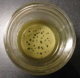
feed the cat food to your cat. or dog. or if it's tuna - you! remove the label, wash & dry the can, then poke holes in the bottom of it from the outside going in. slip it into the Ball jar so the bottom is facing up. then fill the jar with walnut oil to about a quarter-inch over the top of the can - like this:


you can see how clear the oil becomes after the paint has settled to the bottom (the white-ish layer under the can). i was amazed it really works with the oil!

here's a view of the can, bottom-side up with the piercings (i used a nut pick - do be careful not to perforate yourself!):


to use it while i'm painting, i wipe the paint off the brush onto a paper towel or paper napkin, then rub the brush across the can a few times (being careful not to smush the bristles). i then rub it again on a clean spot on the towel, check that it left no color, and it's ready for using again. this has really helped cut down on the number of brushes i use when i do a painting, and makes me more careful to be sure my colors are really clean.

for clean-up when you're done, just do the above to all the brushes, then wash 'em with a mild liquid soap (i use lifeline) & warm water. after that i give them one wash with a commercial brush soap, then rinse, dry with a paper towel & that's that! so much easier & faster!


till next time - take care - and thank you for stopping by!

dusty!